The Good Web Guide
A new direction
The Good Web Guide is a well established web directory that hand picks the very best of the web. The brand and website needed to attract a wider demographic as well as maintain its position as a respected industry player.
We needed to create a marque that could function at any size. In keeping with their old logo, we used the G but adding a circular line interrupted by a mouse cursor. This resembles both a button and a stamp of approval, the result being a simple yet incredibly effective timeless symbol. We wanted to keep the brand as neutral as possible in colour and style, allowing the content to be the main focus. A selection of typefaces were chosen that give the brand a contemporary, journalistic feel without compromising its long established digital roots.
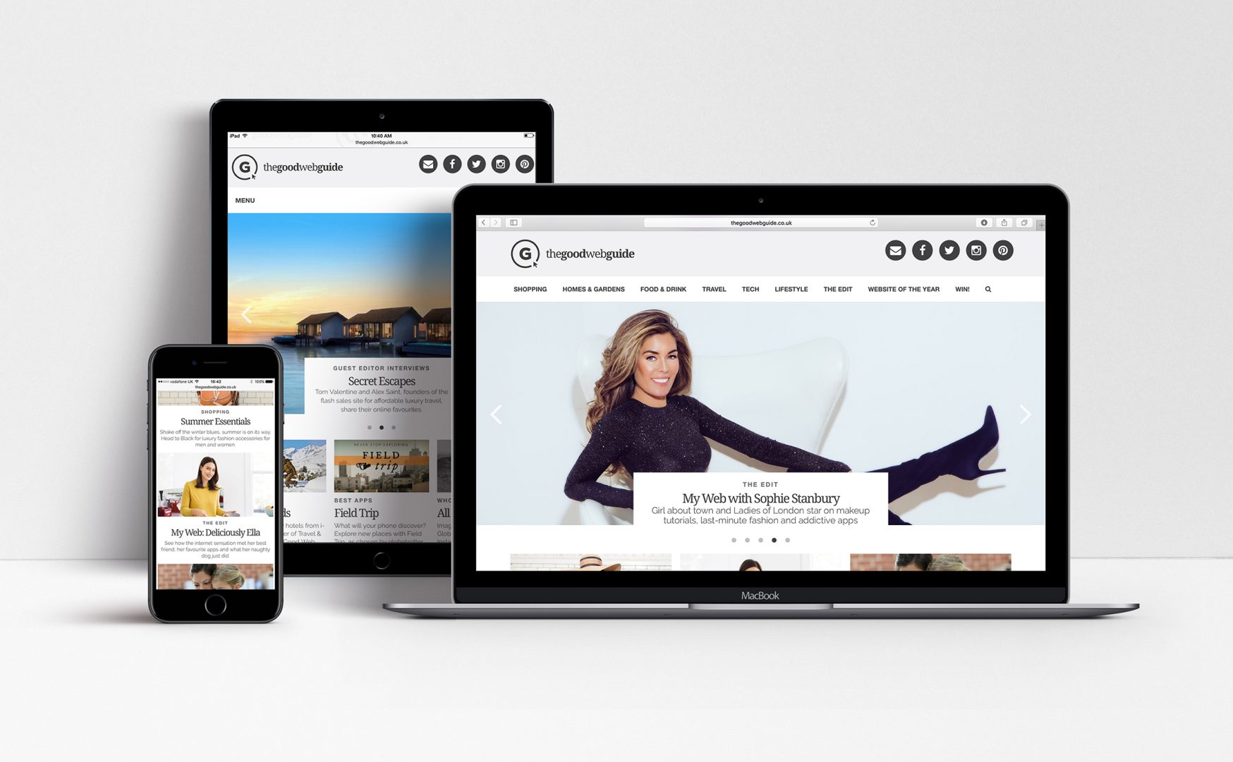
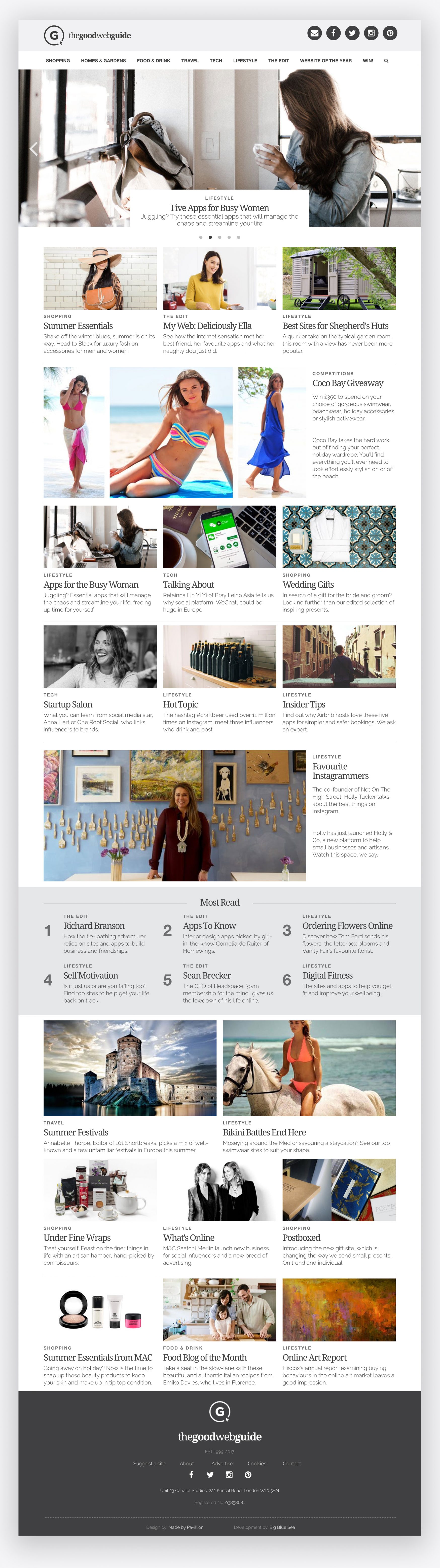
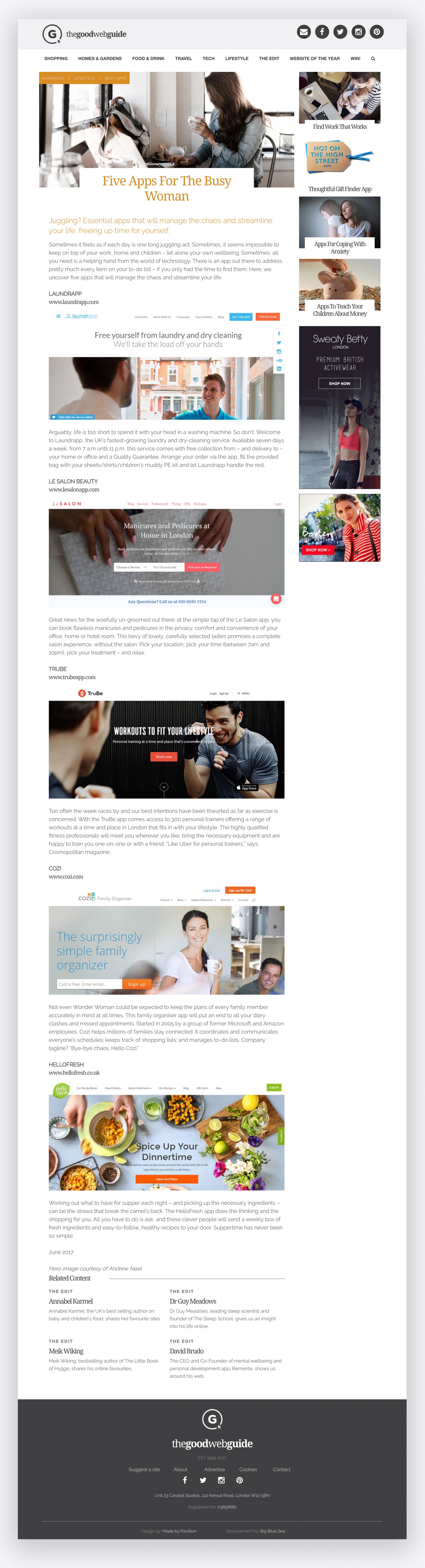
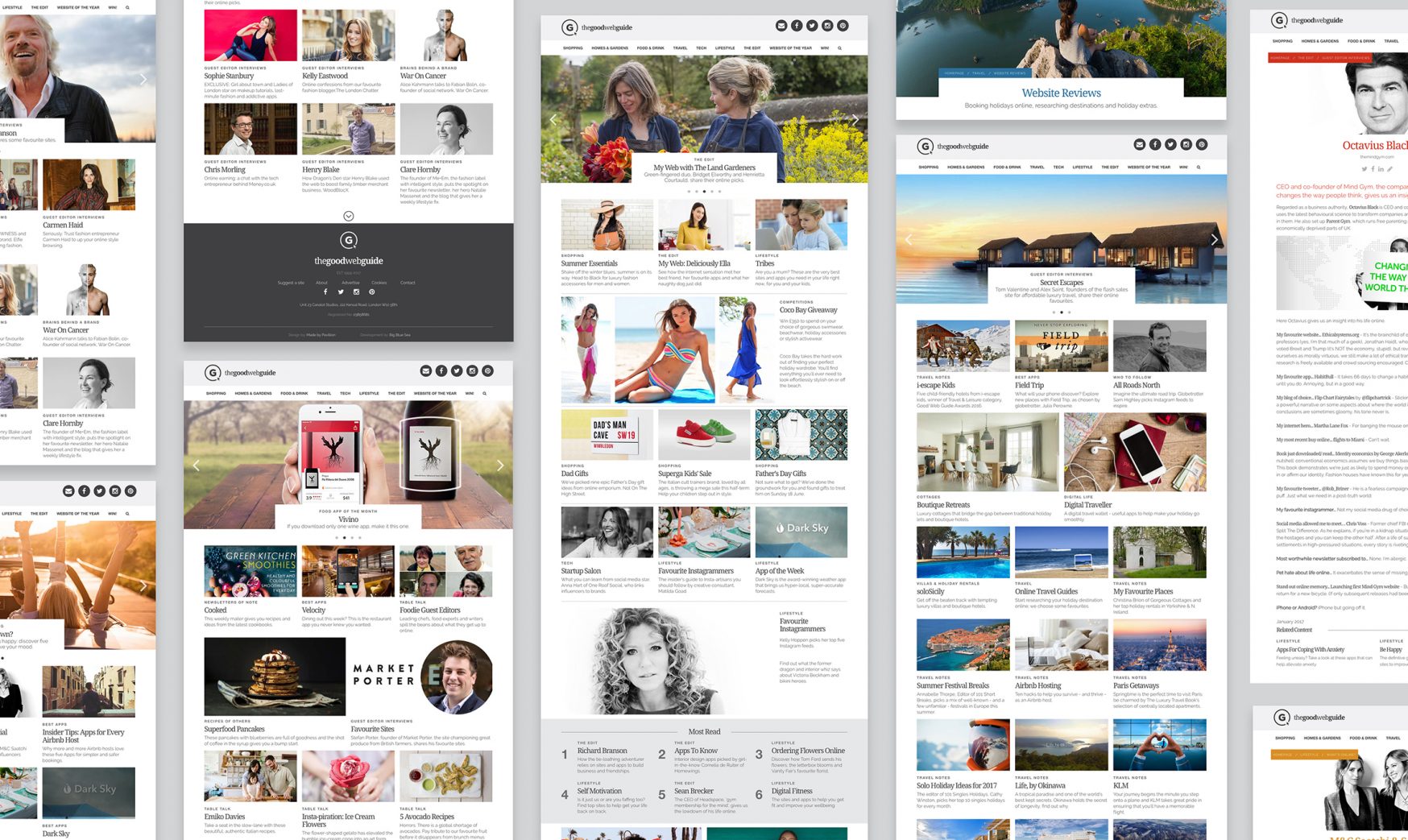
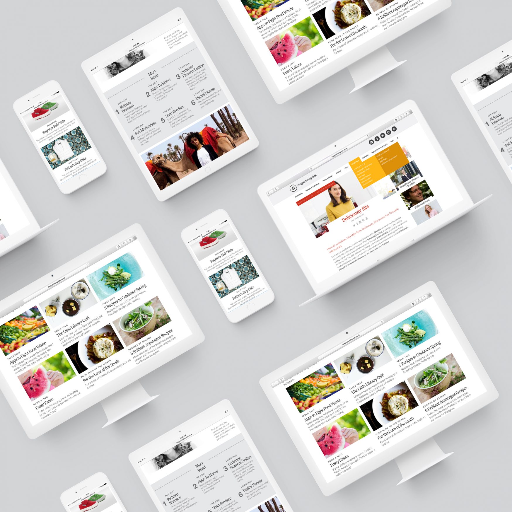
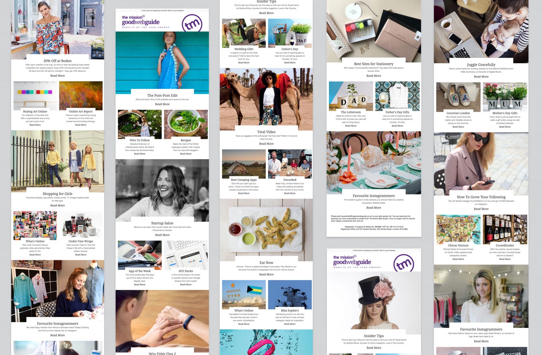
When re-designing the site we realised that imagery was a key driver behind user journeys. For the homepage we created a visual hireachy that allowed the user to vertically scroll whilst remaining engaged by the varying content, giving prominence to certain articles. Content blocks were labelled by category so the user could easily see if the articles are of interest to them. Each subsequent colour coded channel has its own homepage allowing the user to discover and enjoy more relevant content.
Services Provided:
Branding Digital