J.R Carpentry
Craft meet craft
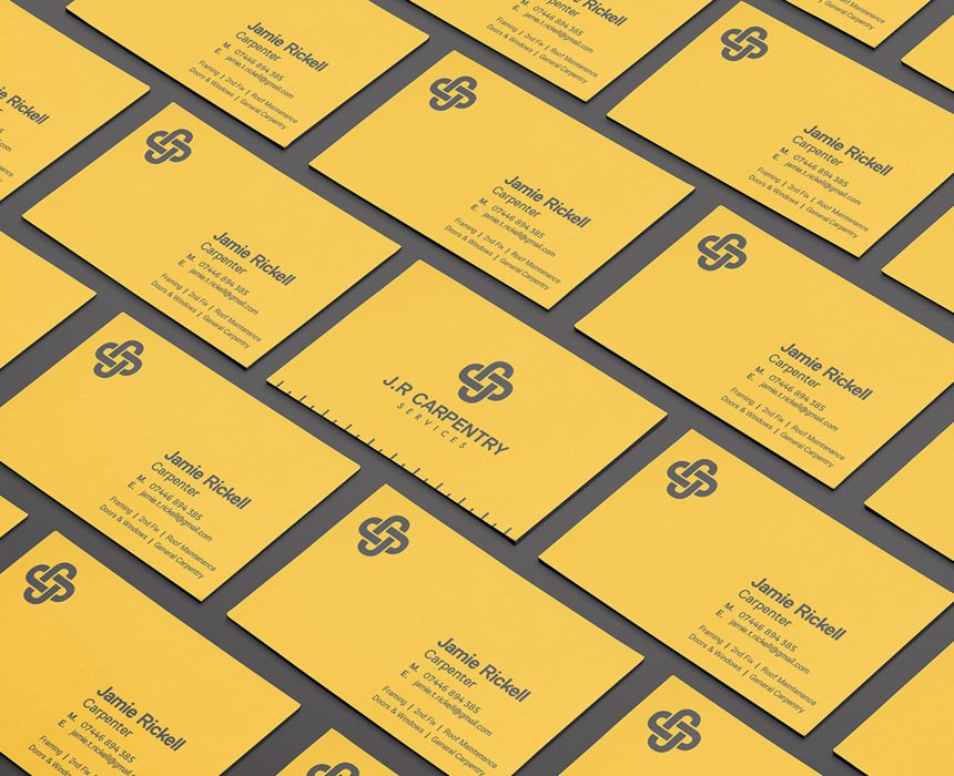
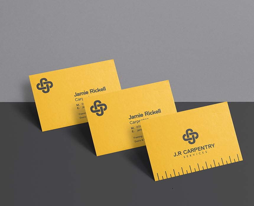
J.R Carpentry is a small firm servicing the building industry and local homes in and around Milton Keynes. They needed an identity that appealed to both construction firms and local residents.
The marque we created plays on the letters J, R and C, which in turn connect like a series of joints to form a confident bold symbol. We chose a modern industrial typeface contrasted with an older established typeface which sits below paying homage to craftsmanship of the past. We have used a ruler as a graphic device as a symbol and measure of accuracy. The yellow and dark grey colour palette synonymous to the construction industry instills confidence.
Services Provided:
Branding Print